If you are familiar with Bitcoin and have done a bit of research on investment strategies then you might have come across a colorful image known as the Bitcoin Rainbow Chart. At first, it might look a little juvenile, something out of a Care Bears Cartoon, but actually, this chart is a super useful tool for potential investment indicators. Each color on the chart represents a specific task that demonstrates the different investing cues of Bitcoin.

In this blog post, we’re going to break down what this colorful band means, looking into what each color represents, from making big moves in trading to knowing when is a good time to buy more BTC.
We will walk you through how to read the chart, understand each color, and most importantly, know how to use the info from the rainbow chart to your advantage for good potential investments.
What is the Bitcoin Rainbow Chart Indicator?
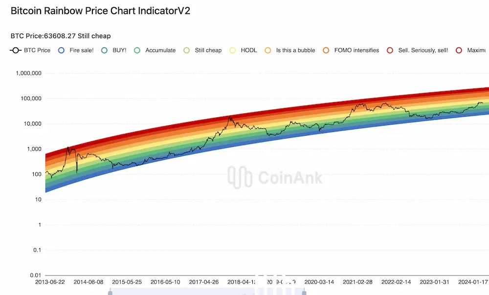
The Rainbow Chart is a useful visual method for tracking Bitcoin’s price fluctuations over time that can be used for new and experienced investors. It is not your typical financial graph or chart that requires a finance degree to understand, rather this chart is fairly easy to interpret since each color represents a specific suggested action.
The chart was originally designed to be a “fun” way to spice up serious investment graphs to map out Bitcoin’s price history. It later became popular among crypto investors because it was so visually easy to read and interpret.
However, it is important to note that there are two versions of this chart: The OG and V2.
What is the difference between Bitcoin chart v2 and OG?
The main difference between the two is that the original version includes the color purple as an indicator that “BITCOIN IS DEAD”. The newer version, which has an updated formula with data up to 2022, has eliminated the option that BTC can die and disappear. Both versions use logarithmic regression, an important feature that helps to show the trends of Bitcoin’s progression.

This chart helps to predict prices and understand BTC trends, giving you a broad view of potential market trends and when is a good moment to buy, sell, HODL! but remember that nothing, not even a rainbow chart, is magical.
By the way, here’s the easiest way to buy Bitcoin.
❗ Remember to use your good judgment when making investments.
How to Read the Bitcoin Rainbow Chart
At first glance, you might be thinking “How do I even begin to understand this thing?”, luckily the Bitcoin Rainbow Chart is pretty straightforward once you understand what the colors represent.
As mentioned before, the chart uses a logarithmic scale, which is important for a few reasons:
- It helps to manage the swings in Bitcoin’s price without letting any single spike or drop take over the visual.
- This scale compresses the higher values more than the lower ones, which makes it easier to see the long-term trends across the rainbow at different price levels.
By the way, here’s the easiest way to buy Bitcoin.
So, when you look at the chart, you see a simplified, color-coded view of when the market might be getting hot and when it might be undervalued.
Color Rainbow Chart – The Cheat Sheet
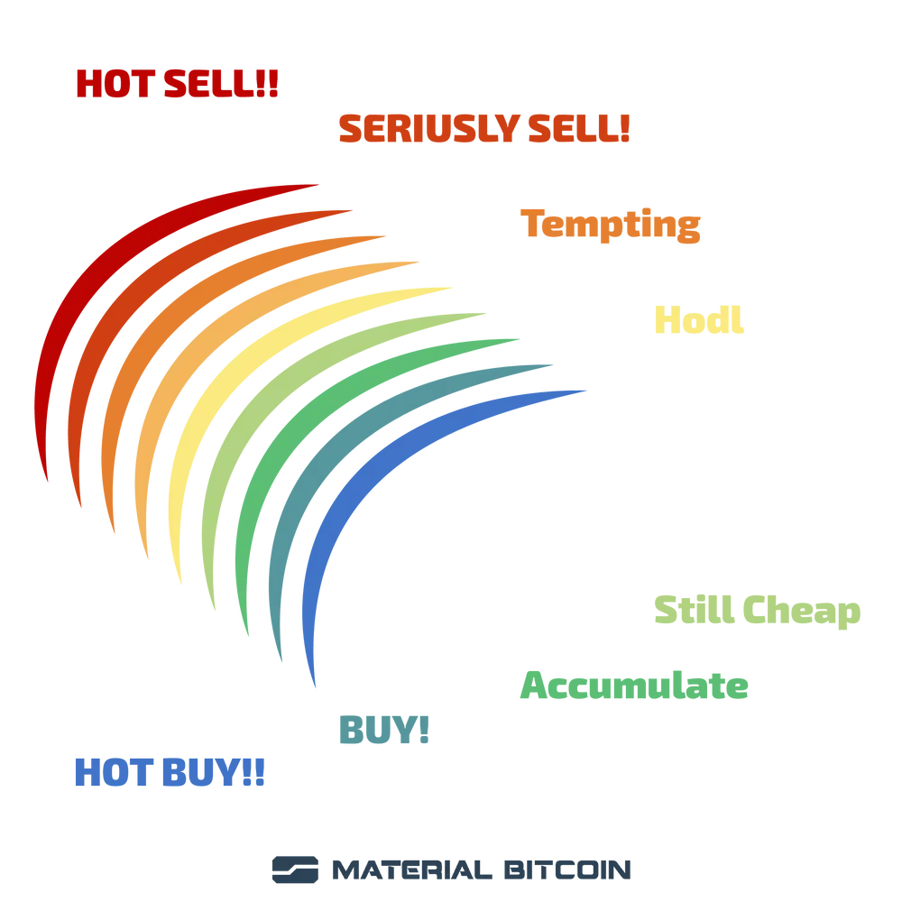
Here’s a quick cheat sheet to help you understand what each section of the rainbow indicates about Bitcoin’s market status:
🔴 Red: Maximum Bubble Territory: This area is screaming hot! It indicates that Bitcoin prices are extremely high compared to historical data. This is when you want to get rid of your BTC and sell because it usually means that a “correction” to pricing might be on its way.
🟠 Dark Orange: Sell – Seriously, Sell!: The orange zone hints at very high prices and is a strong signal to sell since the market is still in unsustainable territory.
🍊 Orange: FOMO Intensifies (Fear of Missing Out): This means that the market is heating up, and prices are getting high. Some investors might start to worry about missing out on rising prices, which can push the demand higher.
🟧 Light Orange: Is This a Bubble?: In this color, the market is pricey but the upward potential is tempting for risk-takers.
💛 Yellow: HODL! (Hold on for Dear Life): The yellow zone is considered the fair value section for Bitcoin. It’s generally a good place to hold onto and store Bitcoin investments for long-term growth.
💚 Light Green: Still Cheap: Here is where we can find some great BTC pricing. It is a good opportunity to buy Bitcoin.
💸 Money Green: Accumulate: Keep adding to the stockpile you are growing.
🟢 Dark Green/Blue: BUY!: Prices are low here, so keep buying, as much as possible.
🔷 Blue: Basically a Fire Sale: This typically occurs in bear markets, and is when Bitcoin is undervalued. Prices are VERY low and the ideal time to buy. Prices might stay low for a while, but it is also a good indicator that things will pick up soon again.

Using the Rainbow Chart
This chart can be used by investors or traders to help identify quick shifts in the market, for example, a change from green to yellow can indicate short-term buying or selling opportunities.
The simplest way of using this chart is to sell your BTC when in the warm colors and buy as much as possible when in the cooler zones.
Regardless of how you use the rainbow chart, the most important thing is to align the insights that you gain from it to what your personal investment goals are with your risk tolerance. This is a great tool and indicator for potential buying and selling moments, but you need to ensure your strategy fits your financial objectives and that you’re not just following the chart blindly.
It is meant to be a tool, not a crystal ball for reading the future.
Advantages and Limitations of Using the Rainbow Chart
💪 Advantage: It is a simple and intuitive visual for understanding BTC pricing and mapping out a good time to invest in Bitcoin.
👎 Limitation: Since the chart is based on past prices, the chart can sometimes mislead the true direction of Bitcoin. It does not account for real-time market changes that affect Bitcoin’s price. So relying on it 100% can be risky if you are not also using other tools and data.
The Yellow Zone: Storing Bitcoin for Long-Term Investment
Some people trade crypto daily as a means of making a profit quickly while other investment strategies indicate that bitcoin long-term investing is the best approach. When it comes to holding Bitcoin for the long haul, secure storage should be one of your top priorities. As we have seen, BTC values have gone up in 2024, which can unfortunately make it a target to hackers and digital criminals.
Storing your crypto safely in a cold wallet is your best bet for keeping your Bitcoins safe.
Among many great hardware cold wallet options, Material Bitcoin Cold wallet stands out as an easy-to-use and secure option. The design of the cold wallet protects your private keys and never leaves the metal plate as it is completely offline. You can easily transfer and even buy more BTC when indicators fall into the green-blue zones, and quickly move it onto the wallet for safekeeping.
FAQ Roundup
How Accurate Is the BTC Rainbow Chart?
- This is a speculative chart since it uses historical pricing data. It does not reflect real-time market pricing.
How is the Rainbow Chart Updated and How Often?
- The chart is updated every 24 hours to indicate daily closing prices by a team of analysts and developers.
Is the Rainbow Chart a Reliable Tool for Predicting the Future Price of Bitcoin?
- The chart uses reliable analysis and data for its indicators. It is a useful tool but shouldn’t be used without other data and market research in conjunction.
Are there any variants or alternatives to the Bitcoin Rainbow Chart?
- Yes, there is the original and version 2 of the BTC chart. Another version of the chart is the Ethereum Rainbow Chart.


0 Comments